Buildbot/Talos/Sheriffing/Perfherder FAQ: Difference between revisions
(go to new page) |
|||
| Line 60: | Line 60: | ||
Common practice is to load up a bunch of related series, and mute/unmute to verify revisions, dates, etc. for a visible regression. | Common practice is to load up a bunch of related series, and mute/unmute to verify revisions, dates, etc. for a visible regression. | ||
[https://wiki.mozilla.org/Performance_sheriffing/Perfherder_FAQ go to new page] | |||
Revision as of 13:49, 13 February 2018
What is Perfherder
[Perfherder] is a tool that takes data points from log files and graphs them over time. Primarily this is used for performance data from [Talos].
The code for Perfherder can be found inside Treeherder [here].
Viewing details on a graph
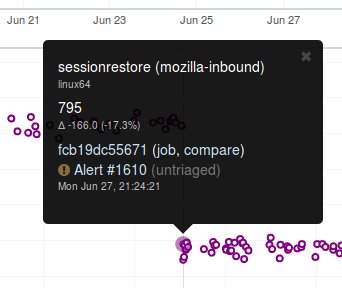
When viewing Perfherder Graph details, in many cases it is obvious where the regression is. If you mouse over the data points (not click on them) you can see some raw data values.
While looking for the specific changeset that caused the regression, you have to determine where the values changed. By moving the mouse over the values you can easily determine the high/low values historically to determine the normal 'range'. When you see values change, it should be obvious that the high/low values have a different 'range'.
If this is hard to see, it helps to zoom in to reduce the 'y' axis. Also zooming into the 'x' axis for a smaller range of revisions yields less data points, but an easier way to see the regression.
Once you find the regression point, you can click on the data point and it will lock the information as a popup. Then you can click on the revision to investigate the raw changes which were part of that.
Note, here you can get the date, revision, and value. These are all useful data points to be aware of while viewing graphs.
Keep in mind, graph server doesn't show if there is missing data or a range of changesets.
Zooming
Perfherder graphs has the ability adjust the date range from a drop down box. We default to 14 days, but we can change it to last day/2/7/14/30/90/365 days from the UI drop down.
It is usually a good idea to zoom out to a 30 day view on integration branches. This allows us to see recent history as well as what the longer term trend is.
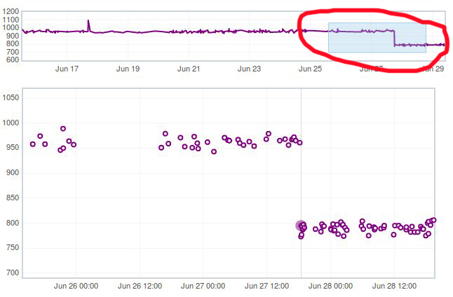
There are two parts in the Perfherder graph, the top box with the trendline and the bottom viewing area with the raw data points. If you select an area in the trendline box, it will zoom to that. This is useful for adjusting the Y-axis.
Here is an example of zooming in on an area:
Adding additional data points
One feature of Perfherder graphs is the ability to add up to 7 sets of data points at once and compare them on the same graph. In fact when clicking on a graph for an alert, we do this automatically when we add multiple branches at once.
While looking at a graph, it is a good idea to look at that test/platform across multiple branches to see where the regression originally started at and to see if it is affected on different branches. There are 3 primary needs for adding data:
- investigating branches
- investigating platforms
- comparing pgo/non pgo/e10s for the same test
For investingating branches click the branch name in the UI and it will pop up the "Add more test data" dialog pre populated with the other branches which has data for this exact platform/test. All you have to do is hit add.
For investigating platforms, click the platform name in the UI and it will pop up the "Add more test data" dialog pre populated with the other platforms which has data for this exact platform/test. All you have to do is hit add.
To do this find the link on the left hand side where the data series are located at "+Add more test data":
Muting additional data points
Once you become familiar with graph server it is a common use case to have [multiple data points] on the graph at a time. This results in a lot of confusing data points if you are trying to zoom in and investigating the values for a given data point.
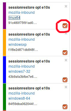
Luckily there is a neat feature in graph server that allows you to mute a data point. There is an 'eye' icon (on by default) that lives in the left hand side bar where you have the list of data series.
If you click this 'eye' icon, it will mute (hide) that series.
Common practice is to load up a bunch of related series, and mute/unmute to verify revisions, dates, etc. for a visible regression. go to new page


