Thunderbird/Netbooks/Designs/Ideas: Difference between revisions
< Thunderbird | Netbooks | Designs
Jump to navigation
Jump to search
(added another mockup and some explanatory text) |
|||
| Line 9: | Line 9: | ||
[[File:tb-netbook-mockup2.png]] | [[File:tb-netbook-mockup2.png]] | ||
= | = message pane = | ||
[[File:tb-netbook-mockup3.png]] | [[File:tb-netbook-mockup3.png]] | ||
[[File:tb-netbook-mockup7.png]] | |||
In order to save space, the message list and message pane could be combined and messages could then expand on single click. | |||
= main message tab = | = main message tab = | ||
Revision as of 10:24, 8 December 2009
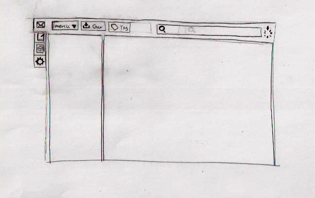
Mockups
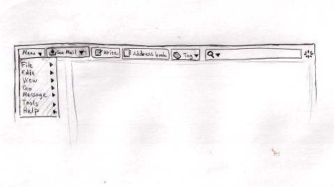
File menu could be a dropdown in the toolbar.
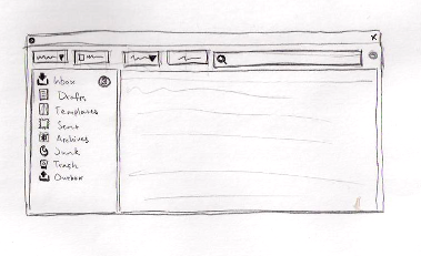
main layout
message pane
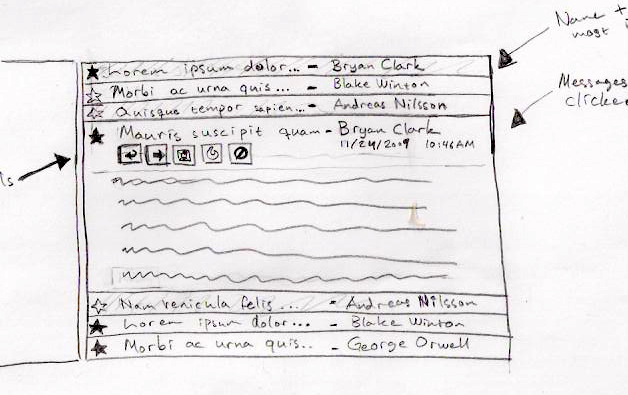
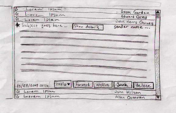
In order to save space, the message list and message pane could be combined and messages could then expand on single click.
main message tab
The regular message reader tab.
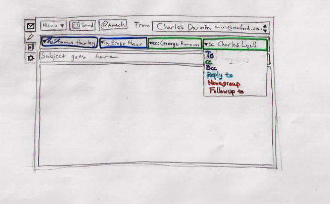
compose tab
Writing a new message is just as easy as selecting the writing tab. Colors indicate to, cc, bcc etc who are all on the same line and offers a dropdown to select between the different types.
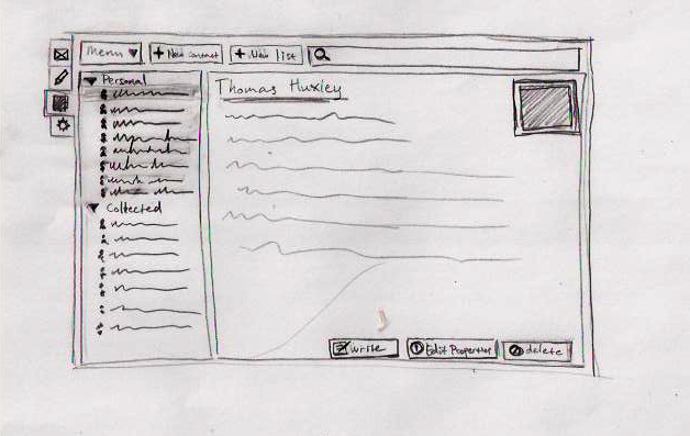
address book tab
A lot of installations ends up with just two address books (personal and collected) and a lot of empty space. This would put address books and contacts in the same pane (that is expandable) and allow the larger amount of the window to the actual contact.
