Gaia/Design/BuildingBlocks: Difference between revisions
Jump to navigation
Jump to search
(Convert massive images to thumbnails) |
|||
| Line 3: | Line 3: | ||
*''' Link to source PSD ''' [https://www.dropbox.com/s/wyuqv3fwpokax73/CommonControls_121005.psd] | *''' Link to source PSD ''' [https://www.dropbox.com/s/wyuqv3fwpokax73/CommonControls_121005.psd] | ||
[[Image:CommonControls 121005.jpg|Dialogue: Common Controls 121005]] | [[Image:CommonControls 121005.jpg|Dialogue: Common Controls 121005|thumbnail|center]] | ||
===Action Menu=== | ===Action Menu=== | ||
| Line 19: | Line 20: | ||
** Selecting one of the actions. | ** Selecting one of the actions. | ||
** Pressing "Cancel" button (verbiage TBD) | ** Pressing "Cancel" button (verbiage TBD) | ||
*''' Link to CSS ''' Work in Progress | *''' Link to CSS ''' Work in Progress | ||
*''' Link to source PSD ''' [https://www.dropbox.com/s/5ae1lmbai91e9js/OWD_Buttons.psd] | *''' Link to source PSD ''' [https://www.dropbox.com/s/5ae1lmbai91e9js/OWD_Buttons.psd] | ||
[[Image:OWD 00 ActionMenu.jpg|Dialogue: Action Menus]] | {| | ||
[[Image:BB_ActionMenu_1.jpg|Dialogue: Action Menus]] | | [[Image:OWD 00 ActionMenu.jpg|Dialogue: Action Menus|thumbnail|center]] | ||
[[Image:BB_ActionMenu_2.jpg|Dialogue: Action Menus]] | | [[Image:BB_ActionMenu_1.jpg|Dialogue: Action Menus|thumbnail|center]] | ||
| [[Image:BB_ActionMenu_2.jpg|Dialogue: Action Menus|thumbnail|center]] | |||
|} | |||
== Banner == | == Banner == | ||
| Line 49: | Line 50: | ||
* Can either be part of an App (eg: a "photos deleted" Banner is associated with the Gallery app) or the System (eg: a "Low Battery" alert). | * Can either be part of an App (eg: a "photos deleted" Banner is associated with the Gallery app) or the System (eg: a "Low Battery" alert). | ||
* Ideally would be designed to prevent two Banner appearing simultaneously (eg: If two Banner appear at same time, newer replaces older). | * Ideally would be designed to prevent two Banner appearing simultaneously (eg: If two Banner appear at same time, newer replaces older). | ||
*''' Link to CSS ''' [https://github.com/mozilla-b2g/gaia/blob/master/shared/style/status.css] | *''' Link to CSS ''' [https://github.com/mozilla-b2g/gaia/blob/master/shared/style/status.css] | ||
*''' Link to source PSD ''' [https://www.dropbox.com/s/1l0vsabud5cv224/OWD_00_Banner.psd] | *''' Link to source PSD ''' [https://www.dropbox.com/s/1l0vsabud5cv224/OWD_00_Banner.psd] | ||
[[Image:OWD 00 Banner.jpg|Dialogue: Banner]] | {| | ||
[[Image:BB_Banner_1.jpg|Dialogue: Banner]] | | [[Image:OWD 00 Banner.jpg|Dialogue: Banner|thumbnail|center]] || [[Image:BB_Banner_1.jpg|Dialogue: Banner|thumbnail|center]] || [[Image:BB_Banner_2.jpg|Dialogue: Banner|thumbnail|center]] | ||
[[Image:BB_Banner_2.jpg|Dialogue: Banner]] | |} | ||
==Buttons== | ==Buttons== | ||
| Line 72: | Line 71: | ||
** normal | ** normal | ||
** Active (pressed) | ** Active (pressed) | ||
*''' Link to CSS ''' [https://github.com/mozilla-b2g/gaia/blob/master/shared/style/buttons.css] | *''' Link to CSS ''' [https://github.com/mozilla-b2g/gaia/blob/master/shared/style/buttons.css] | ||
*''' Link to source PSD ''' [https://www.dropbox.com/s/5ae1lmbai91e9js/OWD_Buttons.psd] | *''' Link to source PSD ''' [https://www.dropbox.com/s/5ae1lmbai91e9js/OWD_Buttons.psd] | ||
[[Image:OWD 01 Buttons.jpg|Dialogue: Banner|thumbnail|center]] | |||
[[Image:OWD 01 Buttons.jpg|Dialogue: Banner]] | |||
== Drawer == | == Drawer == | ||
*''' Link to CSS ''' Work in Progress | *''' Link to CSS ''' Work in Progress | ||
[[Image:OWD wiki Drawer.jpg|Dialogue: Banner]] | [[Image:OWD wiki Drawer.jpg|Dialogue: Banner|thumbnail|center]] | ||
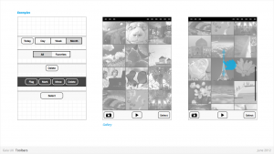
== Filters == | == Filters == | ||
| Line 107: | Line 102: | ||
* Numbering: minimum 2, maximum 5. | * Numbering: minimum 2, maximum 5. | ||
* Can be populated with icons or text, but not both. Because of the smaller height of a filter (versus a tab), text is the best practice. | * Can be populated with icons or text, but not both. Because of the smaller height of a filter (versus a tab), text is the best practice. | ||
* ''' Link to CSS ''' Work in Progress | * ''' Link to CSS ''' Work in Progress | ||
* ''' Link to source PSD ''' [https://www.dropbox.com/s/g64iolxhrm7d8bg/OWD_01_Filters.psd] | * ''' Link to source PSD ''' [https://www.dropbox.com/s/g64iolxhrm7d8bg/OWD_01_Filters.psd] | ||
[[Image:OWD 01 Filters.jpg|Filters 1]] | {| | ||
[[Image:Gaia_BB_Filters.png|Filters 1]] | | [[Image:OWD 01 Filters.jpg|Filters 1|thumbnail|center]] | ||
| [[Image:Gaia_BB_Filters.png|Filters 1|thumbnail|center]] | |||
|} | |||
==Headers== | ==Headers== | ||
| Line 130: | Line 125: | ||
* Optional: heading text string can include text (eg: current unread email count) | * Optional: heading text string can include text (eg: current unread email count) | ||
* Present in most applications | * Present in most applications | ||
*''' Link to "Headers" CSS ''' [https://github.com/mozilla-b2g/gaia/blob/master/shared/style/headers.css] | *''' Link to "Headers" CSS ''' [https://github.com/mozilla-b2g/gaia/blob/master/shared/style/headers.css] | ||
*''' Link to "Edit Mode" CSS '''[https://github.com/mozilla-b2g/gaia/blob/master/shared/style/edit_mode.css] | *''' Link to "Edit Mode" CSS '''[https://github.com/mozilla-b2g/gaia/blob/master/shared/style/edit_mode.css] | ||
*''' Link to Source PSD ''' [https://www.dropbox.com/s/0ro1rb8tg41ynuv/OWD_03_Headers.psd] | *''' Link to Source PSD ''' [https://www.dropbox.com/s/0ro1rb8tg41ynuv/OWD_03_Headers.psd] | ||
[[Image:OWD 03 Headers.jpg |Header 1]] | {| | ||
[[Image:Gaia_BB_Header_1.png|Header 1]] | | [[Image:OWD 03 Headers.jpg |Header 1|thumbnail|center]] | ||
| [[Image:Gaia_BB_Header_1.png|Header 1|thumbnail|center]] | |||
|} | |||
==Lists== | ==Lists== | ||
| Line 157: | Line 151: | ||
** Button row | ** Button row | ||
** Link row | ** Link row | ||
*''' Link to CSS ''' Work in Progress | *''' Link to CSS ''' Work in Progress | ||
*''' Link to Source PSD ''' [https://www.dropbox.com/s/bz314lc8a0bltla/OWD_01_Lists.psd?m] | *''' Link to Source PSD ''' [https://www.dropbox.com/s/bz314lc8a0bltla/OWD_01_Lists.psd?m] | ||
[[Image:OWD 00 Lists.jpg|Lists 1]] | [[Image:OWD 00 Lists.jpg|Lists 1|thumbnail|center]] | ||
== Object Menu == | == Object Menu == | ||
| Line 187: | Line 179: | ||
** Selected object element will be highlighted (e.g.: darken surrounding content?) | ** Selected object element will be highlighted (e.g.: darken surrounding content?) | ||
** Explicit "Cancel" input may be removed in favor of pressing on empty screen real estate to close. | ** Explicit "Cancel" input may be removed in favor of pressing on empty screen real estate to close. | ||
*''' Link to CSS ''' Work in Progress | *''' Link to CSS ''' Work in Progress | ||
*''' Link to source PSD ''' [https://www.dropbox.com/s/uzw0ftpqcn6fc7w/OWD_00_ObjectMenu.psd] | *''' Link to source PSD ''' [https://www.dropbox.com/s/uzw0ftpqcn6fc7w/OWD_00_ObjectMenu.psd] | ||
[[Image:OWD 00 ObjectMenu.jpg |Dialogue: Object Menu]] | {| | ||
[[Image:BB_ObjectMenu_2.jpg|Dialogue: Object Menu]] | | [[Image:OWD 00 ObjectMenu.jpg |Dialogue: Object Menu|thumbnail|center]] | ||
| [[Image:BB_ObjectMenu_2.jpg|Dialogue: Object Menu|thumbnail|center]] | |||
|} | |||
==Progress & Activity Indicators== | ==Progress & Activity Indicators== | ||
| Line 210: | Line 202: | ||
** Activity | ** Activity | ||
*** Displays a looping animation, communicating to the user that the process is active. | *** Displays a looping animation, communicating to the user that the process is active. | ||
*''' Link to CSS ''' Work in Progress | *''' Link to CSS ''' Work in Progress | ||
*''' Link to Source PSD ''' [https://www.dropbox.com/s/kfcce1fnryut1te/OWD_loading_V05.psd] | *''' Link to Source PSD ''' [https://www.dropbox.com/s/kfcce1fnryut1te/OWD_loading_V05.psd] | ||
[[Image:OWD 00 Progress%2BActivity.jpg|Progress & Activity 1]] | {| | ||
[[Image:Gaia_BB_Progress&Activity_1.png|Progress & Activity 1]] | | [[Image:OWD 00 Progress%2BActivity.jpg|Progress & Activity 1|thumbnail|center]] | ||
| [[Image:Gaia_BB_Progress&Activity_1.png|Progress & Activity 1|thumbnail|center]] | |||
|} | |||
== Prompt == | == Prompt == | ||
| Line 239: | Line 231: | ||
** Input: Cancel (optional). | ** Input: Cancel (optional). | ||
*** Can customize label string | *** Can customize label string | ||
*''' Link to CSS ''' [https://github.com/mozilla-b2g/gaia/blob/master/shared/style/confirm.css] | *''' Link to CSS ''' [https://github.com/mozilla-b2g/gaia/blob/master/shared/style/confirm.css] | ||
[[Image:OWD_wiki_Prompts.jpg|Dialogue: Prompt]] | {| | ||
[[Image:BB_Prompt_1.jpg|Dialogue: Prompt]] | | [[Image:OWD_wiki_Prompts.jpg|Dialogue: Prompt|thumbnail|center]] | ||
[[Image:BB_Prompt_2.jpg|Dialogue: Prompt]] | | [[Image:BB_Prompt_1.jpg|Dialogue: Prompt|thumbnail|center]] | ||
[[Image:BB_Prompt_3.jpg|Dialogue: Prompt]] | | [[Image:BB_Prompt_2.jpg|Dialogue: Prompt|thumbnail|center]] | ||
| [[Image:BB_Prompt_3.jpg|Dialogue: Prompt|thumbnail|center]] | |||
|} | |||
==Scrolling== | ==Scrolling== | ||
| Line 259: | Line 252: | ||
** Scrollbar | ** Scrollbar | ||
** Index scrolling | ** Index scrolling | ||
*''' Link to CSS''' Work in Progress | *''' Link to CSS''' Work in Progress | ||
[[Image:OWD wiki Scroll Index.jpg|Scrolling 1]] | [[Image:OWD wiki Scroll Index.jpg|Scrolling 1|thumbnail|center]] | ||
==Seek Bars== | ==Seek Bars== | ||
| Line 276: | Line 268: | ||
* Optional images for left and right values | * Optional images for left and right values | ||
* Can be horizontal or vertical | * Can be horizontal or vertical | ||
*''' Link to CSS ''' Work in Progress | *''' Link to CSS ''' Work in Progress | ||
*''' Link to Source PSD ''' [https://www.dropbox.com/s/mdp3oxxw8j0qeo2/OWD_00_SeekBars.psd] | *''' Link to Source PSD ''' [https://www.dropbox.com/s/mdp3oxxw8j0qeo2/OWD_00_SeekBars.psd] | ||
[[Image:OWD 00 SeekBars.jpg |Seek Bars 1]] | [[Image:OWD 00 SeekBars.jpg |Seek Bars 1|thumbnail|center]] | ||
==Switches== | ==Switches== | ||
| Line 297: | Line 287: | ||
** Radio | ** Radio | ||
** Checkbox | ** Checkbox | ||
*''' Link to CSS ''' [https://github.com/mozilla-b2g/gaia/blob/master/shared/style/switches.css] | *''' Link to CSS ''' [https://github.com/mozilla-b2g/gaia/blob/master/shared/style/switches.css] | ||
*''' Link to source PSD ''' [https://www.dropbox.com/s/00t8x2905jl7vpu/OWD_00_Switches.psd] | *''' Link to source PSD ''' [https://www.dropbox.com/s/00t8x2905jl7vpu/OWD_00_Switches.psd] | ||
[[Image:OWD 00 Switches.jpg|Switches 1]] | [[Image:OWD 00 Switches.jpg|Switches 1|thumbnail|center]] | ||
==Tabs== | ==Tabs== | ||
| Line 327: | Line 315: | ||
* Active | * Active | ||
* Disabled | * Disabled | ||
*''' Link to CSS ''': Work in Progress | *''' Link to CSS ''': Work in Progress | ||
*''' Link to source PSD ''' [https://www.dropbox.com/s/9l6g3mb0870m64o/OWD_02_Tabs.psd] | *''' Link to source PSD ''' [https://www.dropbox.com/s/9l6g3mb0870m64o/OWD_02_Tabs.psd] | ||
[[Image:OWD 03 Tabs.jpg |Tabs 1]] | [[Image:OWD 03 Tabs.jpg |Tabs 1|thumbnail|center]] | ||
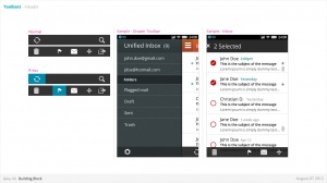
==Tool Bars== | ==Tool Bars== | ||
| Line 351: | Line 337: | ||
* Should be positioned at the bottom of the screen unless Tabs are also present. In that case, should be positioned at the top. | * Should be positioned at the bottom of the screen unless Tabs are also present. In that case, should be positioned at the top. | ||
* Can contain various elements (buttons, filters, progress/activity indicators, etc). | * Can contain various elements (buttons, filters, progress/activity indicators, etc). | ||
*''' Link to CSS''' Work in Progress | *''' Link to CSS''' Work in Progress | ||
[[Image:OWD wiki Toolbars.jpg|Toolbars 1]] | {| | ||
[[Image:Gaia_BB_Toolbars_1.png|Toolbars 1]] | | [[Image:OWD wiki Toolbars.jpg|Toolbars 1|thumbnail|center]] | ||
[[Image:Gaia_BB_Toolbars_2.png|Toolbars 2]] | | [[Image:Gaia_BB_Toolbars_1.png|Toolbars 1|thumbnail|center]] | ||
| [[Image:Gaia_BB_Toolbars_2.png|Toolbars 2|thumbnail|center]] | |||
|} | |||
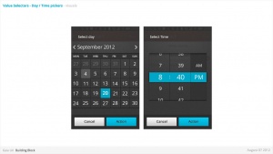
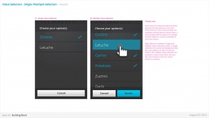
== Value Selector== | == Value Selector== | ||
| Line 374: | Line 361: | ||
** Single-select list | ** Single-select list | ||
** Multiple-select list | ** Multiple-select list | ||
*''' Link to CSS / Date - Time Picker ''' Work in Progress | *''' Link to CSS / Date - Time Picker ''' Work in Progress | ||
*''' Link to CSS / Single-Multiple ''' [https://github.com/mozilla-b2g/gaia/tree/master/apps/system/style/bb] | *''' Link to CSS / Single-Multiple ''' [https://github.com/mozilla-b2g/gaia/tree/master/apps/system/style/bb] | ||
[[Image:OWD wiki ValueSelector01.jpg |Value Selector]] | {| | ||
[[Image:OWD wiki ValueSelector02.jpg |Value Selector]] | | [[Image:OWD wiki ValueSelector01.jpg |Value Selector|thumbnail|center]] || [[Image:OWD wiki ValueSelector02.jpg |Value Selector|thumbnail|center]] || [[Image:BB_ValueSel_2.jpg|Value Selector|thumbnail|center]] | ||
[[Image:BB_ValueSel_2.jpg|Value Selector]] | |- | ||
[[Image:BB_ValueSel_3.jpg|Value Selector]] | | [[Image:BB_ValueSel_3.jpg|Value Selector|thumbnail|center]] || [[Image:BB_ValueSel_1.jpg|Value Selector|thumbnail|center]] | ||
[[Image:BB_ValueSel_1.jpg|Value Selector]] | |} | ||
== Input Areas == | == Input Areas == | ||
*''' Link to CSS ''' [https://github.com/mozilla-b2g/gaia/blob/master/shared/style/input_areas.css] | *''' Link to CSS ''' [https://github.com/mozilla-b2g/gaia/blob/master/shared/style/input_areas.css] | ||
*''' Link to Source PSD''' [https://www.dropbox.com/s/9pcmukgbwsmdmo3/OWD_00_InputAreas.psd] | *''' Link to Source PSD''' [https://www.dropbox.com/s/9pcmukgbwsmdmo3/OWD_00_InputAreas.psd] | ||
[[Image:OWD 00 InputAreas.jpg |Dialogue: Banner]] | [[Image:OWD 00 InputAreas.jpg |Dialogue: Banner|thumbnail|center]] | ||
Revision as of 23:09, 10 October 2012
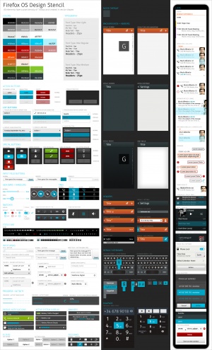
Common Controls
- Link to source PSD [1]
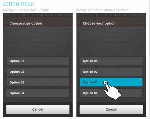
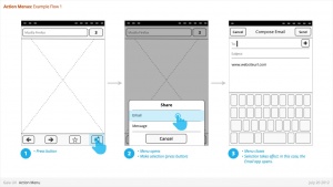
Action Menu
Used for:
- Presenting a list of actions related to the App content.
Characteristics:
- Are opened from buttons within App content. These buttons are often inside Toolbars (eg: Browser's "Share" button).
- Contain 1 or more items.
- Expand in height to accomodate contents, to a maximum of the screen height, at which point contents scroll. Best practice is to include maximum of 5 items + Title.
- Title strings are optional.
- Are closed by:
- Selecting one of the actions.
- Pressing "Cancel" button (verbiage TBD)
- Link to CSS Work in Progress
- Link to source PSD [2]
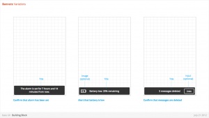
Banner
Used for:
- Relay information to the user. eg:
- Confirm a user action
- Alert to a system event
Characteristics:
- Most common used after Multi-Select edit, to confirm user action, and optional provide "Undo" input. eg:
- Deleting multiple photos from (Gallery)
- Deleting multiple emails (Email)
- Moving multiple emails (Email)
- Are positioned at the bottom of screen, covering underlying content.
- Appear for X seconds then automatically disappear.
- Can include an input, eg: "Undo" (optional)
- Can include an image (optional)
- Can either be part of an App (eg: a "photos deleted" Banner is associated with the Gallery app) or the System (eg: a "Low Battery" alert).
- Ideally would be designed to prevent two Banner appearing simultaneously (eg: If two Banner appear at same time, newer replaces older).
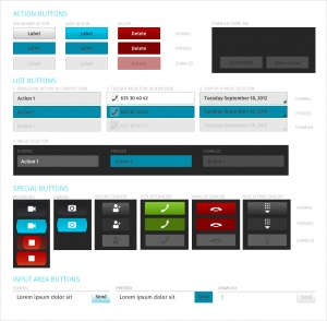
Buttons
Characteristics:
- Have two components: visual target and hit target.
- Later is always larger. Has minimum sizes.
- Types:
- Icon + text
- Icon only
- Text only
- States:
- normal
- Active (pressed)
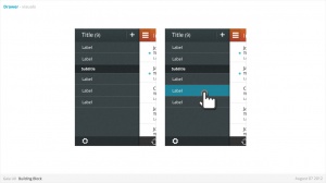
Drawer
- Link to CSS Work in Progress
Filters
Used for:
- Secondary Navigation
- Filters can provide a second set of tabs, where tabs are already present.
- Data Filter
- Filters can be used to enable the user to view a single set of data in a different lens.
- eg: in Calendar, the filters they allow user to view time in different scales, from Day to Month).
Characteristics:
- Horizontal sequence of buttons.
- Only one button is Focused at a time.
- Best practice is to place filters within Toolbars, so they do not flow with the content.
- Left, Middle and Right buttons can be styled uniquely.
- Width: variable, depending on number of filters required within a single set (see Numbering). Should establish a maximum width, however.
- Numbering: minimum 2, maximum 5.
- Can be populated with icons or text, but not both. Because of the smaller height of a filter (versus a tab), text is the best practice.
- Link to CSS Work in Progress
- Link to source PSD [7]
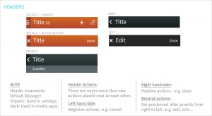
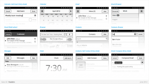
Headers
Used for:
- Labeling the active view.
- Providing top-level navigation and inputs for the active view.
Characteristics:
- Horizontal full width bar that appears at top of screen in most apps
- Floats above content, with option to flow with content in some rare cases (eg: Browser).
- Heading text provides name of current view.
- Optional: heading text string can include text (eg: current unread email count)
- Present in most applications
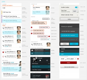
Lists
Used for:
- Displaying an enumeration of a set of items
Characteristics:
- Varying heights (1—3 rows)
- Varying contents (from text only to image + text + button)
- Are composed of rows, and section headers
- Types:
- Action row (click anywhere to trigger input)
- Status indicator row
- Button row
- Link row
- Link to CSS Work in Progress
- Link to Source PSD [11]
Object Menu
Used for:
- Directly manipulating objects without having to open them and navigate deeper into the hierarchy. eg:
- Deleting a photo by selecting it's thumbnail, instead of having to open the full image.
- Flag an email by selecting it's preview, instead of having to open the full email.
- Call a Contact by selecting their name, instead of having to open their detailed information.
Characteristics:
- Accessed by user press-and-hold on selectable object (eg: list row, phone number, URL, etc)
- Menu appears after X seconds.
- Contain 1 or more items
- Expand in height to accomodate contents, to a maximum of the screen height, at which point contents scroll. Best practice is to include maximum of 5 items + Title.
- Title strings are not included (unlike Action Menus)
- Are closed by pressing "Cancel" button.
- Reuse the Action Menu interface.
- Future (v2):
- Menu will explicitly tie itself to selected element by opening immediately above or below, shifting to fit into the available screen real estate.
- Selected object element will be highlighted (e.g.: darken surrounding content?)
- Explicit "Cancel" input may be removed in favor of pressing on empty screen real estate to close.
- Link to CSS Work in Progress
- Link to source PSD [12]
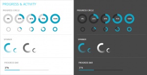
Progress & Activity Indicators
Used for:
- Providing user with visual feedback that a process is active.
Characteristics:
- May include an animated visual element, a text label, or some combination of the two.
- Types:
- Progress
- Displays a loading animation that goes from 0 to 100 percent, communicating the current process status.
- Activity
- Displays a looping animation, communicating to the user that the process is active.
- Progress
- Link to CSS Work in Progress
- Link to Source PSD [13]
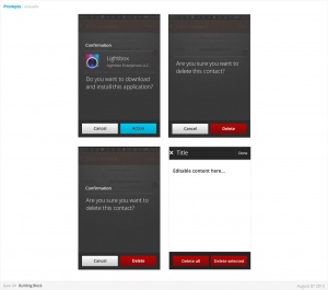
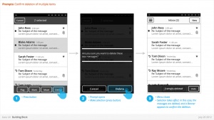
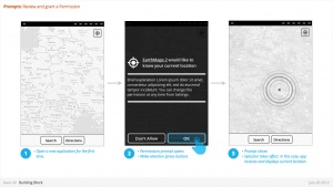
Prompt
Used for:
- Prompts user to take action. eg:
- Confirm a deletion
- Respond to a system event (eg: restart device after a SIM card swap)
- Grant or deny a permission
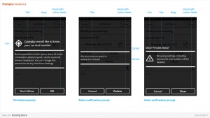
Characteristics:
- Modal: occupies the screen and requires user input to clear.
- Consists: of
- Title
- Body (optional)
- Icon (optional)
- Input: Confirmation.
- Can customize label string
- Input: Cancel (optional).
- Can customize label string
- Link to CSS [14]
Scrolling
Used for:
- Vertically slide text, images and/or video across the device's display.
Characteristics:
- Types:
- Scrollbar
- Index scrolling
- Link to CSS Work in Progress
Seek Bars
Used for:
- Scroll through content (i.e. a song or video)
Characteristics:
- Consists of track and knob (button w/ normal and pressed states)
- Optional images for left and right values
- Can be horizontal or vertical
- Link to CSS Work in Progress
- Link to Source PSD [15]
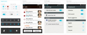
Switches
Used for:
- Activates/Deactivates a given item. It's also used to select an element within a list.
Characteristics:
- Presents two mutually exclusive choices or states (used in table views only).
- Types:
- On/Off toggle
- Radio
- Checkbox
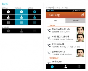
Tabs
Used for:
- Allows multiple instances to be contained within a single window. Tabs are used as a navigational widget for switching between sets of views.
Characteristics:
- Fill the full horizontal width.
- Number between 3—5.
- Positioned at bottom of screen.
- Can contain various elements (buttons, filters, indicators, etc).
- Versions:
- Text + icon
- Icon-only
States:
- Normal
- Pressed
- Active
- Disabled
- Link to CSS : Work in Progress
- Link to source PSD [18]
Tool Bars
Used for:
- Contains actions, indicators, and navigation associated with the current view. eg:
- Delete selected items (button)
- Refresh content (button)
- Enter “Edit” mode (filter)
- View “Favorite” contacts only (filter)
Characteristics:
- 100% width. Fixed height.
- Does not scroll with content. Floats above.
- Should be positioned at the bottom of the screen unless Tabs are also present. In that case, should be positioned at the top.
- Can contain various elements (buttons, filters, progress/activity indicators, etc).
- Link to CSS Work in Progress
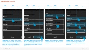
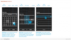
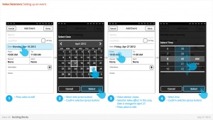
Value Selector
Used for:
- Provides a way for the user to select one of more values, usually from a Form interface.
- Most commonly associated with forms (eg: Setting up a Calendar event).
Characteristics:
- Can include Title (optional)
- Types:
- Date
- Time
- Single-select list
- Multiple-select list
- Link to CSS / Date - Time Picker Work in Progress
- Link to CSS / Single-Multiple [19]
