Gaia/Design/BuildingBlocks
Jump to navigation
Jump to search
Common Controls
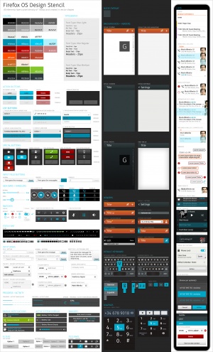
- Source PSD (contains all controls in one file)
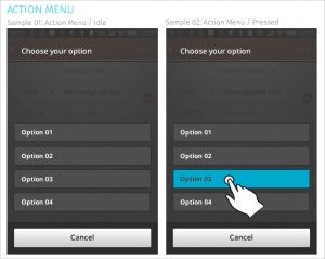
Action Menu
Used for:
- Presenting a list of actions related to the App content.
Characteristics:
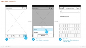
- Are opened from buttons within App content. These buttons are often inside Toolbars (eg: Browser's "Share" button).
- Contain 1 or more items.
- Expand in height to accomodate contents, to a maximum of the screen height, at which point contents scroll. Best practice is to include maximum of 5 items + Title.
- Title strings are optional.
- Are closed by:
- Selecting one of the actions.
- Pressing "Cancel" button (verbiage TBD)
- Link to CSS Work in Progress
- Link to source PSD [1]
Banner
Used for:
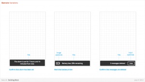
- Relay information to the user. eg:
- Confirm a user action
- Alert to a system event
Characteristics:
- Most common used after Multi-Select edit, to confirm user action, and optional provide "Undo" input. eg:
- Deleting multiple photos from (Gallery)
- Deleting multiple emails (Email)
- Moving multiple emails (Email)
- Are positioned at the bottom of screen, covering underlying content.
- Appear for X seconds then automatically disappear.
- Can include an input, eg: "Undo" (optional)
- Can include an image (optional)
- Can either be part of an App (eg: a "photos deleted" Banner is associated with the Gallery app) or the System (eg: a "Low Battery" alert).
- Ideally would be designed to prevent two Banner appearing simultaneously (eg: If two Banner appear at same time, newer replaces older).
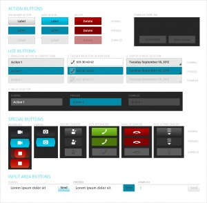
Buttons
Characteristics:
- Have two components: visual target and hit target.
- Later is always larger. Has minimum sizes.
- Types:
- Icon + text
- Icon only
- Text only
- States:
- normal
- Active (pressed)
Drawer
- Link to CSS Work in Progress
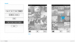
Filters
Used for:
- Secondary Navigation
- Filters can provide a second set of tabs, where tabs are already present.
- Data Filter
- Filters can be used to enable the user to view a single set of data in a different lens.
- eg: in Calendar, the filters they allow user to view time in different scales, from Day to Month).
Characteristics:
- Horizontal sequence of buttons.
- Only one button is Focused at a time.
- Best practice is to place filters within Toolbars, so they do not flow with the content.
- Left, Middle and Right buttons can be styled uniquely.
- Width: variable, depending on number of filters required within a single set (see Numbering). Should establish a maximum width, however.
- Numbering: minimum 2, maximum 5.
- Can be populated with icons or text, but not both. Because of the smaller height of a filter (versus a tab), text is the best practice.
- Link to CSS Work in Progress
- Link to source PSD [6]
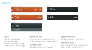
Headers
Used for:
- Labeling the active view.
- Providing top-level navigation and inputs for the active view.
Characteristics:
- Horizontal full width bar that appears at top of screen in most apps
- Floats above content, with option to flow with content in some rare cases (eg: Browser).
- Heading text provides name of current view.
- Optional: heading text string can include text (eg: current unread email count)
- Present in most applications
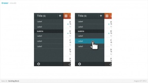
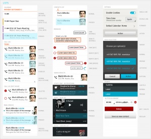
Lists
Used for:
- Displaying an enumeration of a set of items
Characteristics:
- Varying heights (1—3 rows)
- Varying contents (from text only to image + text + button)
- Are composed of rows, and section headers
- Types:
- Action row (click anywhere to trigger input)
- Status indicator row
- Button row
- Link row
- Link to CSS Work in Progress
- Link to Source PSD [10]
Object Menu
Used for:
- Directly manipulating objects without having to open them and navigate deeper into the hierarchy. eg:
- Deleting a photo by selecting it's thumbnail, instead of having to open the full image.
- Flag an email by selecting it's preview, instead of having to open the full email.
- Call a Contact by selecting their name, instead of having to open their detailed information.
Characteristics:
- Accessed by user press-and-hold on selectable object (eg: list row, phone number, URL, etc)
- Menu appears after X seconds.
- Contain 1 or more items
- Expand in height to accomodate contents, to a maximum of the screen height, at which point contents scroll. Best practice is to include maximum of 5 items + Title.
- Title strings are not included (unlike Action Menus)
- Are closed by pressing "Cancel" button.
- Reuse the Action Menu interface.
- Future (v2):
- Menu will explicitly tie itself to selected element by opening immediately above or below, shifting to fit into the available screen real estate.
- Selected object element will be highlighted (e.g.: darken surrounding content?)
- Explicit "Cancel" input may be removed in favor of pressing on empty screen real estate to close.
- Link to CSS Work in Progress
- Link to source PSD [11]
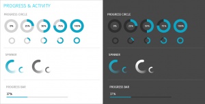
Progress & Activity Indicators
Used for:
- Providing user with visual feedback that a process is active.
Characteristics:
- May include an animated visual element, a text label, or some combination of the two.
- Types:
- Progress
- Displays a loading animation that goes from 0 to 100 percent, communicating the current process status.
- Activity
- Displays a looping animation, communicating to the user that the process is active.
- Progress
- Link to CSS Work in Progress
- Link to Source PSD [12]
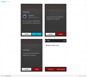
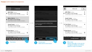
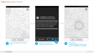
Prompt
Used for:
- Prompts user to take action. eg:
- Confirm a deletion
- Respond to a system event (eg: restart device after a SIM card swap)
- Grant or deny a permission
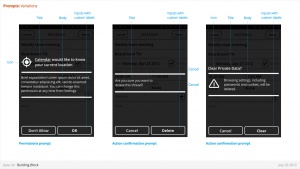
Characteristics:
- Modal: occupies the screen and requires user input to clear.
- Consists: of
- Title
- Body (optional)
- Icon (optional)
- Input: Confirmation.
- Can customize label string
- Input: Cancel (optional).
- Can customize label string
- Link to CSS [13]
Scrolling
Used for:
- Vertically slide text, images and/or video across the device's display.
Characteristics:
- Types:
- Scrollbar
- Index scrolling
- Link to CSS Work in Progress
Seek Bars
Used for:
- Scroll through content (i.e. a song or video)
Characteristics:
- Consists of track and knob (button w/ normal and pressed states)
- Optional images for left and right values
- Can be horizontal or vertical
- Link to CSS Work in Progress
- Link to Source PSD [14]
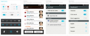
Switches
Used for:
- Activates/Deactivates a given item. It's also used to select an element within a list.
Characteristics:
- Presents two mutually exclusive choices or states (used in table views only).
- Types:
- On/Off toggle
- Radio
- Checkbox
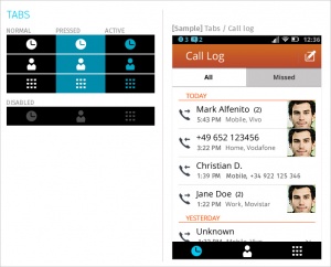
Tabs
Used for:
- Allows multiple instances to be contained within a single window. Tabs are used as a navigational widget for switching between sets of views.
Characteristics:
- Fill the full horizontal width.
- Number between 3—5.
- Positioned at bottom of screen.
- Can contain various elements (buttons, filters, indicators, etc).
- Versions:
- Text + icon
- Icon-only
States:
- Normal
- Pressed
- Active
- Disabled
- Link to CSS : Work in Progress
- Link to source PSD [17]
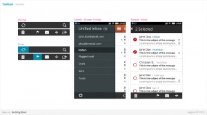
Tool Bars
Used for:
- Contains actions, indicators, and navigation associated with the current view. eg:
- Delete selected items (button)
- Refresh content (button)
- Enter “Edit” mode (filter)
- View “Favorite” contacts only (filter)
Characteristics:
- 100% width. Fixed height.
- Does not scroll with content. Floats above.
- Should be positioned at the bottom of the screen unless Tabs are also present. In that case, should be positioned at the top.
- Can contain various elements (buttons, filters, progress/activity indicators, etc).
- Link to CSS Work in Progress
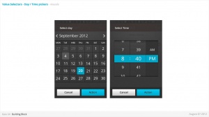
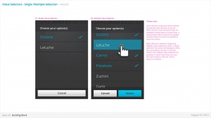
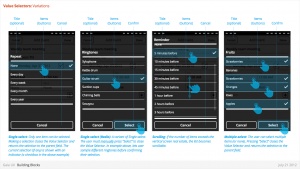
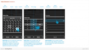
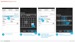
Value Selector
Used for:
- Provides a way for the user to select one of more values, usually from a Form interface.
- Most commonly associated with forms (eg: Setting up a Calendar event).
Characteristics:
- Can include Title (optional)
- Types:
- Date
- Time
- Single-select list
- Multiple-select list
- Link to CSS / Date - Time Picker Work in Progress
- Link to CSS / Single-Multiple [18]
